The Live Editor for Template 1 in the Bookingor plugin allows you to visually customize the booking layout in real-time. This guide covers all available customization options including sidebar, fonts, background styling, and buttons.
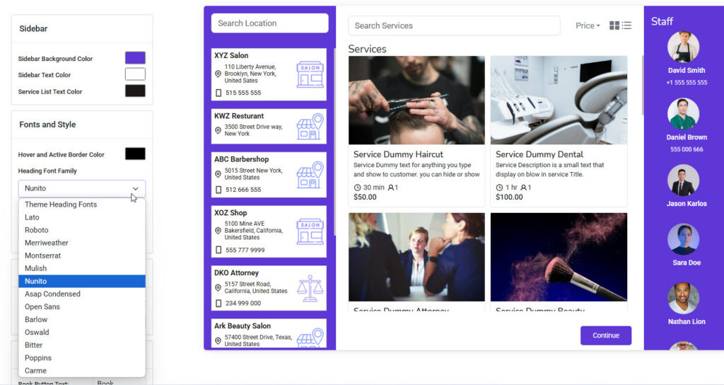
Sidebar
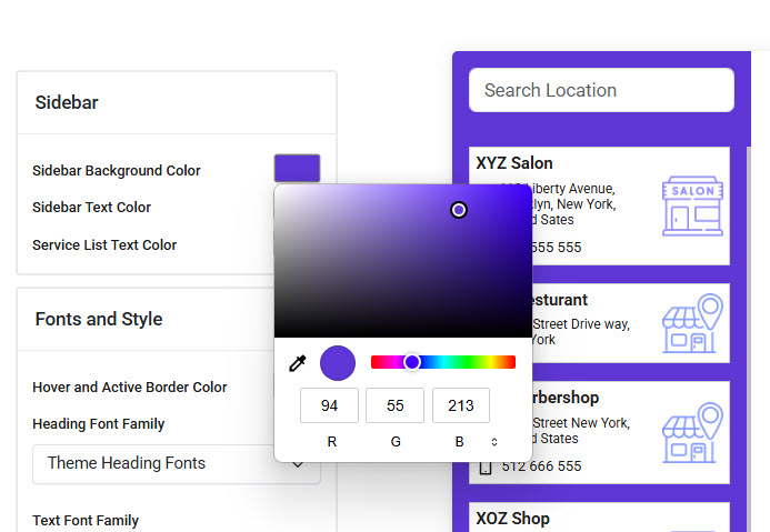
Sidebar Background Color
Customize the background color of the sidebar sections. Use a color that aligns with your brand identity.
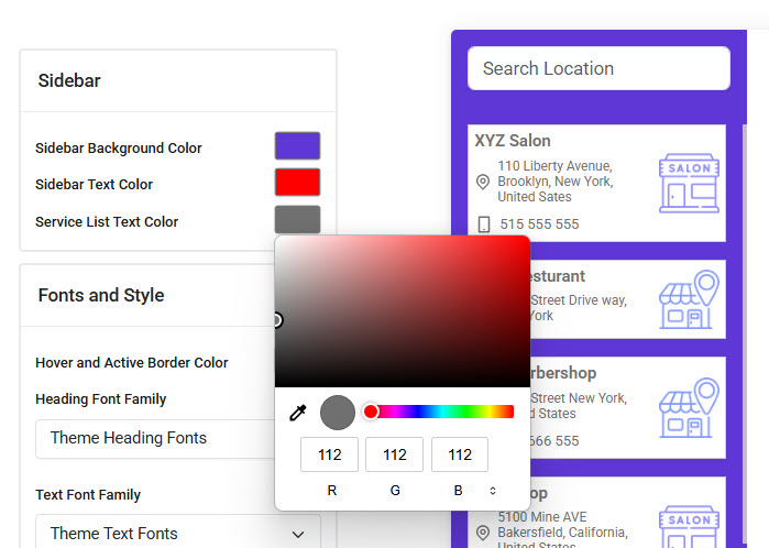
Sidebar Text Color
Adjust the text color used within the sidebars, Make sure the color is readable against the chosen background.
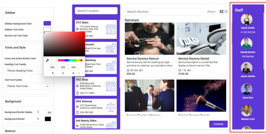
List Text Color
Define the text color used for services displayed in the middle section. This includes the title, description, time, and pricing.
Fonts and Style
The Fonts and Style settings allow you to define the look and feel of your template by customizing text and interactive elements.
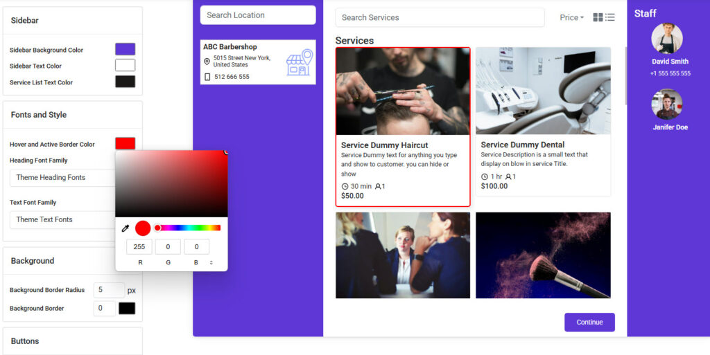
Hover and Active Border Color
This option allows you to set the border color that appears when a user hovers over or actively selects a location, service, or staff member. It enhances the visual feedback and highlights user interactions. Choose a color that contrasts well with your background for better visibility.
Heading Font Family
Select the font used for all major headings within the booking interface, such as "Services", "Staff", and "Customer Information". This font plays a key role in setting the visual tone of the template
Text Font Family
Choose the font used for all regular body text including descriptions, addresses, service details, and contact information. This ensures readability and complements your selected heading font.
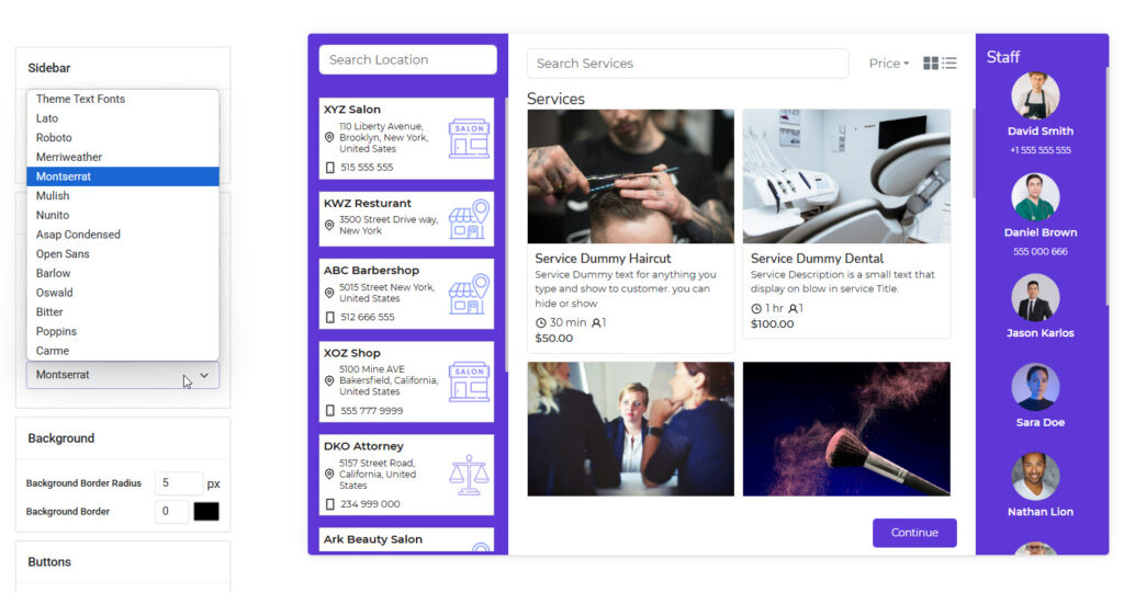
Background
The Background section helps you adjust the overall visual frame of the booking template by customizing the background panel borders.
Background Border Radius
Set the roundness of the outer edges of the background elements.
- A higher value (e.g., 10px or more) will create smooth, curved corners.
- A lower value (e.g., 0–2px) will keep the design more squared and sharp.
This option gives your template a modern or classic look based on your branding style.
Background Border
Add a border around the background area.
- You can specify the border width (e.g., 1px, 2px) and choose a border color to highlight or frame the template’s outer area.
- It’s a great way to subtly separate the booking form from the rest of your website layout.
Buttons
The Buttons section lets you customize all primary and secondary button elements used throughout the booking process.
Book Button Text
Set the label for the main booking action button. By default, it says "Book", but you can change it to fit your flow (e.g., “Reserve”, “Next Step”).
Continue Button Text
Define the text for the Continue button, which is used to proceed through multi-step booking forms. The default is "Continue".
Book Button Background
Customize the background color of the Book button. Choose a color that stands out against the rest of your layout, drawing the user’s attention to the primary action.
Book Button Text Color
Set the color of the text inside the Book button. Make sure it has good contrast with the background for readability.
Button Border
Add a border to your buttons. You can set the thickness and color to give the button a distinct outline.
Button Border Radius
Define how rounded the corners of the buttons should be. A higher value makes the button more circular; a lower value keeps it sharp and square.
Back Button Text
Set the label for the Back button used to return to previous steps in the booking process. You can change it to something like “Previous” or “Go Back”.
Back Button Background Color
Customize the background color of the Back button to visually separate it from the primary action buttons.
Back Button Text Color
Choose the text color for the Back button. Make sure it contrasts well with the background color for visibility.


